My first serious foray into stock trading came in 2013. I had just read William O’Neal’s excellent book, “How to Make Money in Stocks: A Winning System in Good Times and Bad”. This book details a complete trading system called “CANSLIM” for trading stocks showing strong fundamentals and technical performance. Excited by what I learned, I committed myself to learning more about this system, and initially used it as the primary system in my trading account.
The CANSLIM system takes into consideration a number of factors, such as earnings performance and relative strength. One component of the CANSLIM system is to time the entry into long positions using breakouts from certain geometric patterns on stock charts, such as a cup with handle or double bottom.
It’s been some time and my trading style has evolved. I’m no longer using the CANSLIM system and in particular trading breakouts from chart patterns. However, with the benefit of more experience and a fresh set of eyes, I thought it would interesting to revisit chart patterns and provide one trader’s perspective on their relavence today.
Learning More about Chart Patterns
As a developing CANSLIM style trader, I also tried to learn everything I could about chart patterns. Besides William O’Neals book, I studied stock charts from current companies and resources from other traders and authors like Thomas Bulkowski.
Given my professional background in software development, I also developed a software tool called “Chart Pattern Finder” to automatically recognize these patterns and draw them for further analysis.
Mixed Results Trading CANSLIM with Chart Patterns
Despite devoting myself to the CANSLIM system and trading pattern breakouts, my initial results were admittedly lackluster. Using this system, I was basically breaking even.
Although William O’Neal’s book and trading career is very praiseworthy, there is some debate in the trading community regarding the effectiveness of CANSLIM in today’s markets. Specifically, there is also debate on entering positions during chart pattern breakouts.
To be fair, I think my initial lackluster performance had more to do with me being a new and inexperienced trader than the CANSLIM system itself. For example, looking back at my early trades, I see evidence of impatience, over-trading, too much emphasis on chart patterns, and trying to use a system which wasn’t necessarily a good fit for my experience level and personality.
As a new and inexperienced trader, I found it very difficult to trade with chart patterns. It’s one thing to read about other traders making similar trades, but something else entirely to trust your own analysis and put your own hard-earned money into a trade. What I found difficult was the “hard right edge”; i.e., having to make tough decisions in real time and with real money, but not knowing what will happen next.
Evolving as a Trader
Although I eventually moved on from CANSLIM, I’ve continued to study the financial markets and learn from different traders. I still trade stocks in strong uptrends and with strong relative strength, but trade in smaller position sizes, orient more around volatility and momentum, and typically hold positions for longer periods.
I currently don’t trade breakouts from chart patterns, but I still believe there are some merits to analyzing chart patterns themselves. For example, chart patterns can be used for identifying potential exit points rather than entry points. They also highlight important dynamics of supply and demand, such as accumulation and consolidation.
Like many other traders, I currently trade with technical analysis indicators like Bollinger Bands, RSI, ATR and moving averages; I’ve even developed a few of my own indicators, including one which focuses on momentum and volatility. In general, I think these types of indicators have become more widely used in the trading community than chart patterns. However, even if a trader prefers using technical indicators over chart patterns, there is certainly merit to combining the analysis of chart patterns with technical analysis from computer-generated indicators; even the CANSLIM system incorporates the 50 day moving average.
Analyzing Some Chart Patterns in 2019
Fast forward to April, 2019. I recently decided to open source the Chart Pattern Finder tool I previously developed for CANSLIM style trading. As part of this process, I made some minor updates to the software code and ran the tool with some data for Nasdaq 100 companies. Having evolved as a trader, I thought it would be interesting to analyze and comment on some recent chart patterns.
After topping out in November, 2018, Apple (AAPL) fell into a steep decline and formed a falling wedge pattern:
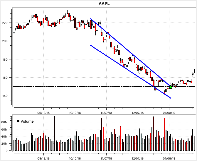
In a previous article, I wrote about short-selling; as an example, I talked about weakening demand for iPhones being a possible catalyst for AAPL’s falling stock price. With this in mind, it would have been hard for me to enter a long trade with the breakout of this falling wedge; my thinking would be the breakout consists of more traders covering their short positions, rather than pent-up demand. Even though AAPL rallied 25% after breaking out from the falling wedge, it would have been impossible to know this when entering the trade.
The above being said, one bullish characteristics of the AAPL chart is the “stopping volume” which occurs a few days before the breakout. In other words, there is a spike in volume, but the price doesn’t continue lower. This is one indication the price is finding a bottom, and large/institutional investors are stepping in to support the price at this level.
Netflix (NFLX) also experienced a downtrend and formed a falling wedge pattern at the end of 2018:

The NFLX breakout occurred about a week before the company’s earning announcement. Many traders avoid entering positions going into earnings, so their positions aren’t exposed to volatility and sudden price movements. In the case of the NFLX breakout, the price rallied going into earnings; perhaps this was a case of traders expecting a positive earnings announcement, and not wanting to miss out on potential gains.
Intuitive Surgical (ISRG) rallied from December, 2018 through March, 2019, forming a rising wedge pattern:
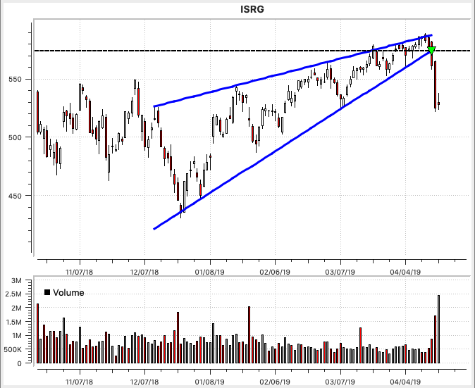
This ISRG rising wedge is about as close to a textbook pattern and breakout as you’ll ever see. The pattern comes to a narrow point at the end, offering a good risk vs. reward ratio. Leading into the breakout, there is a burst of volume, signaling strong selling pressure. After the breakout, there is continued high volume.
Xilinx (XLNX) also formed a rising wedge which terminated in March, 2019:
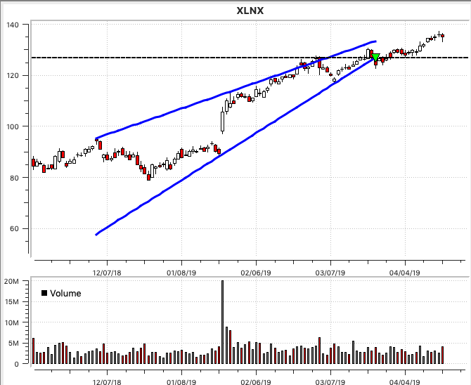
Unlike the ISRG rising wedge, there is not increased volume associated with the breakout. The chart pattern itself doesn’t have the wave-like motion like the ISRG rising wedge does. Within the pattern itself, the XLNX price action looks more to me like steady demand, rather than an ebb and flow of supply and demand.
Symantec (SYMC) just recently broke out from an ascending triangle pattern:
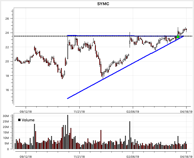
The SYMC ascending triangle looks like a relatively good pattern to me. The pattern reached a narrow point, offering a good risk:reward ratio. However, even though the breakout itself occurred with a spike in volume, the volume hasn’t increased since; this could be a warning sign there isn’t sustained, pent-up demand. Time will tell how the breakout from this pattern turns out.
Coming into 2019, Facebook (FB) formed a double bottom pattern:
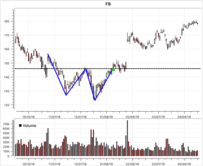
Similar to the NFLX pattern above, the breakout occurred just before FB’s earnings announcement. However, unlike NFLX, the price drifted sideways after the initial breakout. After the earning’s announcement, the price gapped up. Even though FB has rallied since the breakout, I think this pattern would have been difficult to trade; in particular:
- The price action leading into the breakout is almost straight up. There’s not really a good place to place a stop loss order, although something in the $140 range would have worked.
- After the breakout, a rectangular pattern forms for the next 2 weeks. Traders who tried to enter the trade on a breakout from this rectangular area would have missed out, since the price gapped up after earnings.
Synopsys (SNPS) also formed a double bottom pattern, which terminated at the end of February, 2019:
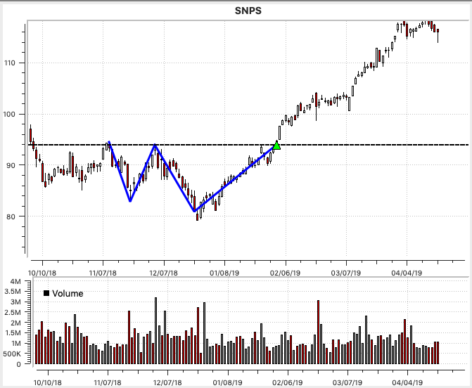
There are some notable characteristics of the SNPS double bottom pattern and breakout. First, leading into the breakout, a small handle had formed. One possibility is to place a stop loss order underneath this handle, near $90. The breakout occurred about 3 weeks before the company’s earning announcement; I think this is long enough to give the stock a chance to rally, perhaps exiting early if the price goes sideways leading into earnings.
Beware of Cherry-picked Patterns
The analysis above leads me to an important point about trading real money with these types of chart patterns. When learning about chart patterns from a book or website, you’ll often see cherry-picked, “textbook” chart patterns which show a profitable outcome or highlight a particular pattern’s characteristics. The patterns above were selected to highlight interesting pattern characteristics; for example, the XLNX rising wedge shown above is an example of a textbook pattern.
Moreover, if you follow other traders, they will often only share their profitable trades; after all, given human nature, who would want to share their failed trades? Similarly, if a website is selling a subscription, it wouldn’t be very good marketing to highlight failed trades, or traders who weren’t successful with their system.
To a new and inexperienced trader, this type of cherry-picking can mislead you into thinking trading chart pattern breakouts is easy. In reality, this type of discretionary trading is messy and difficult; in particular:
- No matter how much careful analysis you do leading into a trade, anything can happen after a breakout. The price could go sideways, turn against you, or experience high volatility and hit your stop loss.
- It’s often difficult to get a good order fill during a breakout. Even using stop-limit orders, the price will often gap through the breakout point.
- Even if the price eventually reaches its price target, when the stock experiences high volatility, it’s very difficult not to lose confidence and exit the trade early.
- Especially for new traders, I think entering positions during breakouts can be psychologically difficult. Before entering the trade, you’ve identified a chart pattern and peform a careful analysis of other factors to convince yourself this is a good stock to own; in other words, you start to convince yourself you’re right and become emotionally attached to a successful outcome. In reality, 40-50% of the trades will fail; you’ll be stopped out, proven wrong, and lose some of your hard-earned money. Much of this is true for any type of trading, but I think entering discretionary trades during breakouts has a certain climactic feel to it, making failure all the more difficult.
Are Chart Patterns Still Relevant?
Thus far, I’ve given a mixed review of chart patterns, and a more negative view of trading chart pattern breakouts. This is influenced by my own lackluster performance as a new and experienced trader, and my evolution as a trader to prefer technical indicators and other types of setups over chart pattern breakouts. While I don’t necessarily recommend trading breakouts from patterns, I do believe patterns are still relavent and can play a role in one’s trading. For example:
- To the extent these patterns still form today (see above for examples), they are arguably relevant.
- It can be said these chart patterns capture and illustrate some fundamental dynamics of supply and demand, such as consolidation and accumulation. Patterns can frame the price action in a way which allows you to more easily analyze the structure of price movements and the ebb and flow of supply and demand.
- Knowing what I know now, the fact that I basically broke even as a beginning trader using CANSLIM and chart patterns is not bad at all. As a more experience trader, I can envision revisiting chart patterns and combining them with other tools and techniques.
- Even though I wrote a tool to automatically draw certain types of chart patterns, choosing which patterns to trade is discretionary. In so far as chart patterns support discretionary trading, I think they can be useful to discretionary traders.
- Besides trading breakouts, there are other ways to trade chart patterns. For example, some traders fade breakouts, while others trade in the opposite direction of failed breakouts. They can also be used to time exits from positions.
Summary
Not having traded with chart patterns for several years, it was an interesting exercise to revisit and analyze some recent chart patterns. I believe technical analysis indicators like Bollinger Bands, RSI and moving averages are currently used more frequently. However, the examples I provided above clearly demonstrate that chart patterns are still forming in today’s markets, and arguably have a role to play in a trader’s overall analysis of the markets and individual stocks.